Back to projects
Art Direction, Print, Graphic Design

Trends & Colors: Annual Design Guide

An annual trend guide series exploring the interior design trends and colors shaping commercial spaces, connecting emerging movements to the company’s planter product range. Each edition positioned the brand as a knowledgeable resource for its audience, while sparking ideas for what was possible with biophilic design in the workplace.

Role Art Director & Graphic Designer
Timeline 2019 - 2024
Deliverables Art Direction, Print, Graphic Design

The Context & Why

Each year, a new set of interior design trends and colors shifts the way commercial spaces get designed, and that created a natural opportunity to produce something useful. Commercial buyers and plant professionals are always looking ahead, thinking about what spaces could become and how emerging trends translate into real environments.

The guide was never meant to be a product catalog. It worked because it led with ideas first. By anchoring each edition to that year’s trends and color stories shaping commercial interiors, the content spoke directly to how the audience thought about their work. Planters and biophilic design principles appeared not as a sales push, but as an obvious fit within movements already gaining momentum.

Challenges & Approach

The audience for this guide, commercial buyers and plant professionals, are knowledgeable and visually literate. Generic design content wouldn’t hold their attention. The work had to feel credible and specific enough to be useful, while still being accessible to a range of buyers across different project types.

Because this was a side project with creative freedom, the process was largely self-directed. Research meant staying close to what was actually happening in commercial interiors: tracking trade publications, sourcing photography from real office and hospitality environments, and identifying which trends had enough traction to be worth covering. The goal wasn’t to predict trends but to synthesize them in a way that helped the audience see their own projects more clearly.

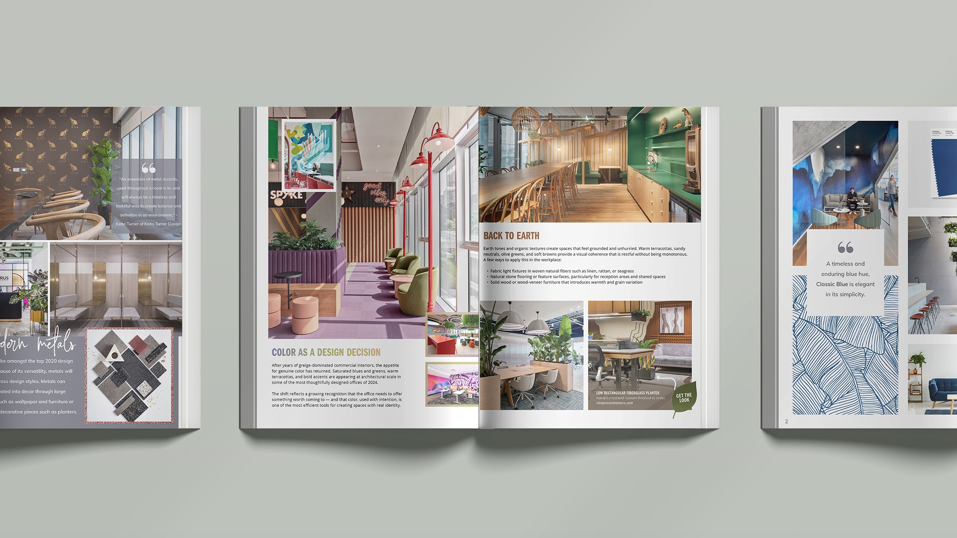
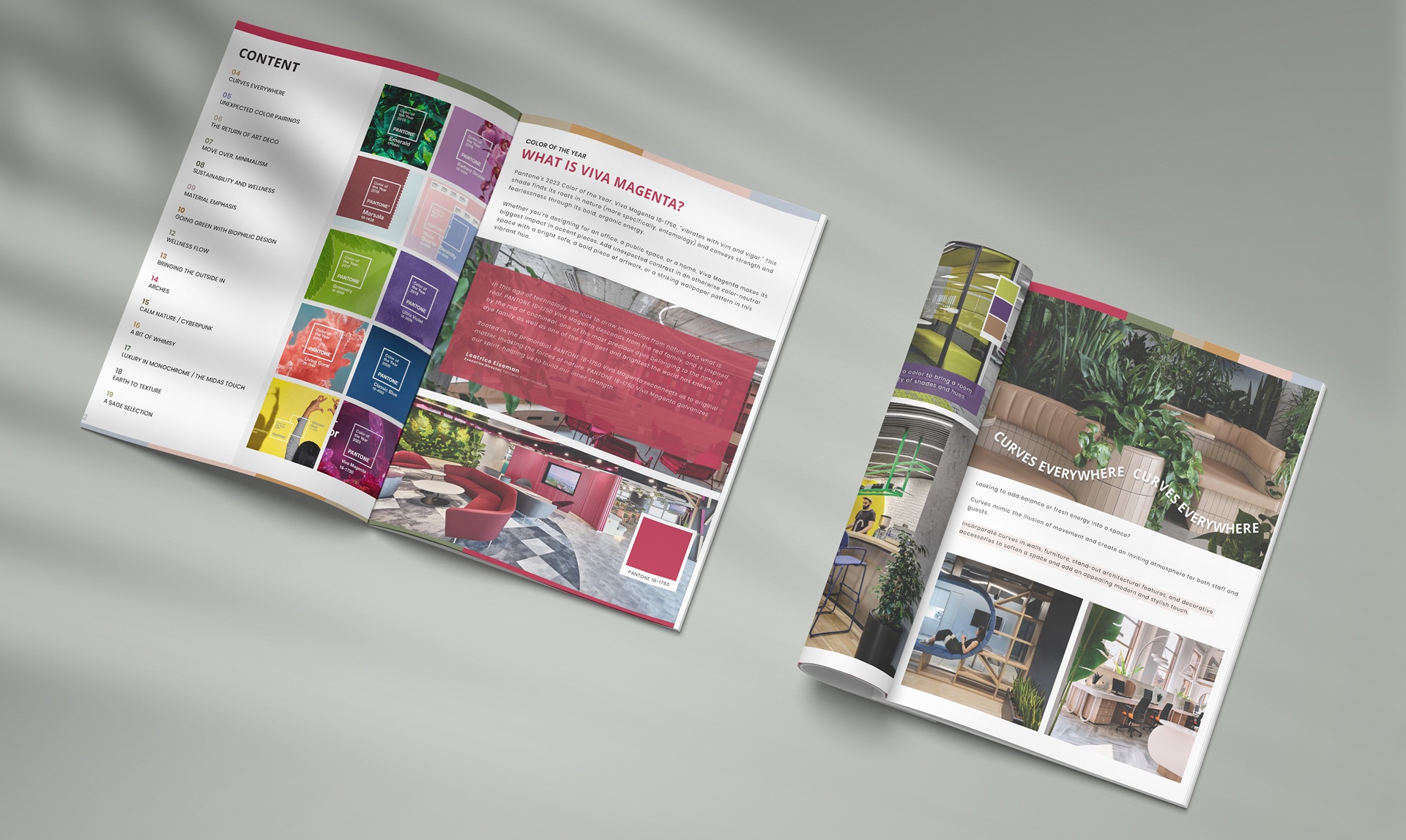
One consistent challenge was writing copy that served both the design content and the product without making that connection feel forced. The balance came from leading with the trend and letting the relevance of planters and biophilic design follow naturally. When the marketing team brought edits or directional input, that feedback was a welcome part of the process. It kept the content aligned with broader brand goals and often pushed the writing to be clearer and more focused.

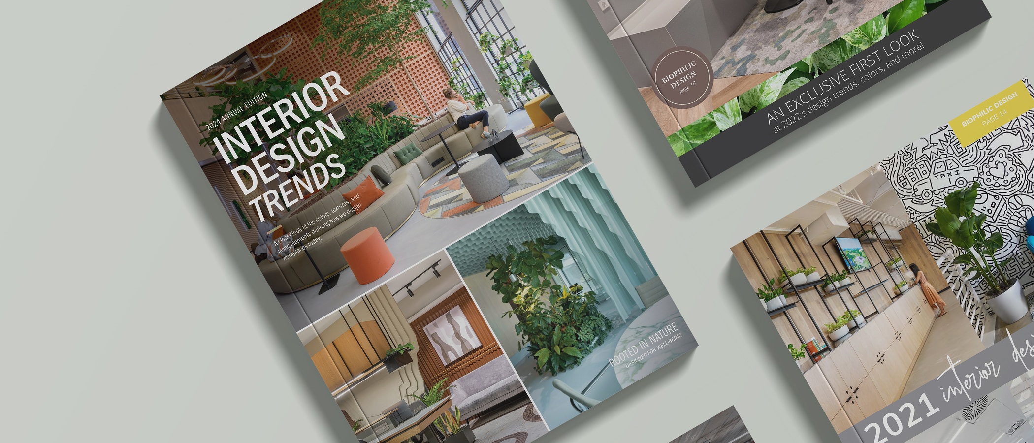
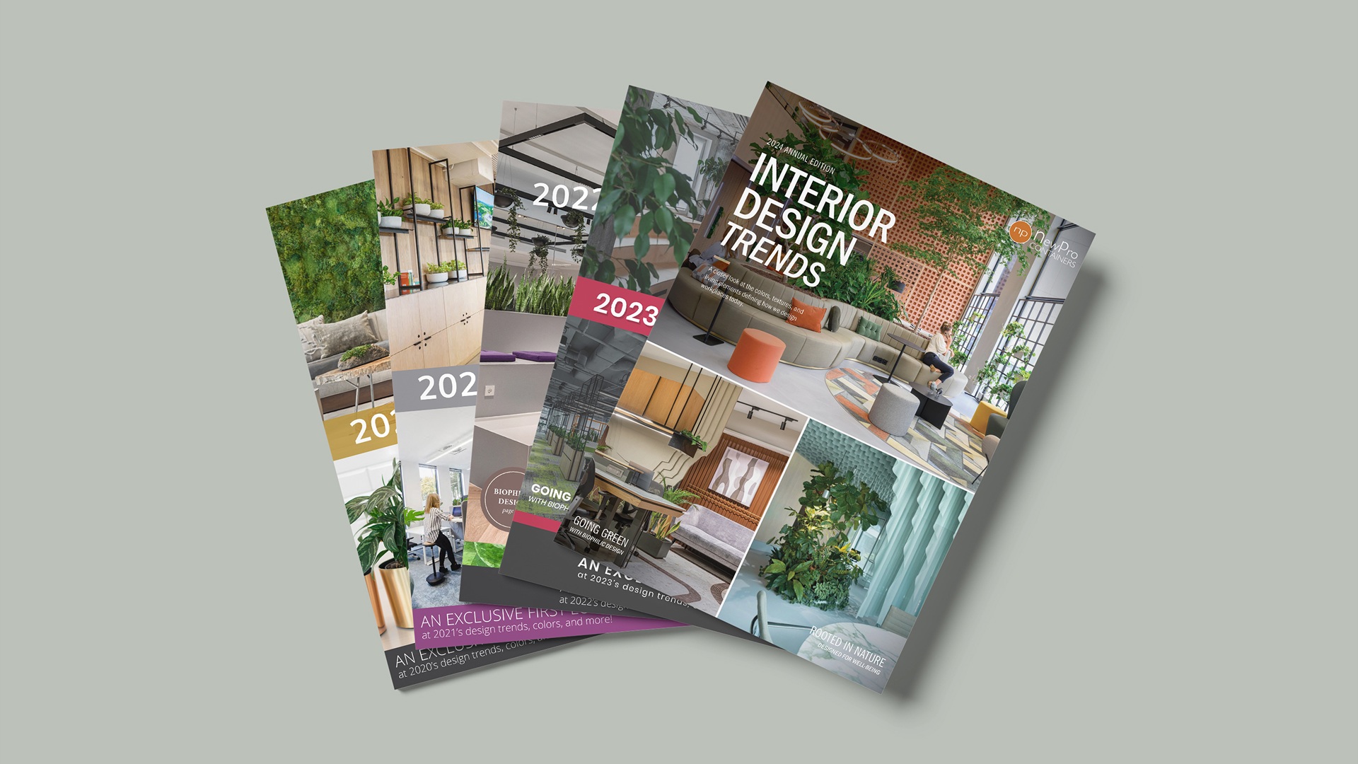
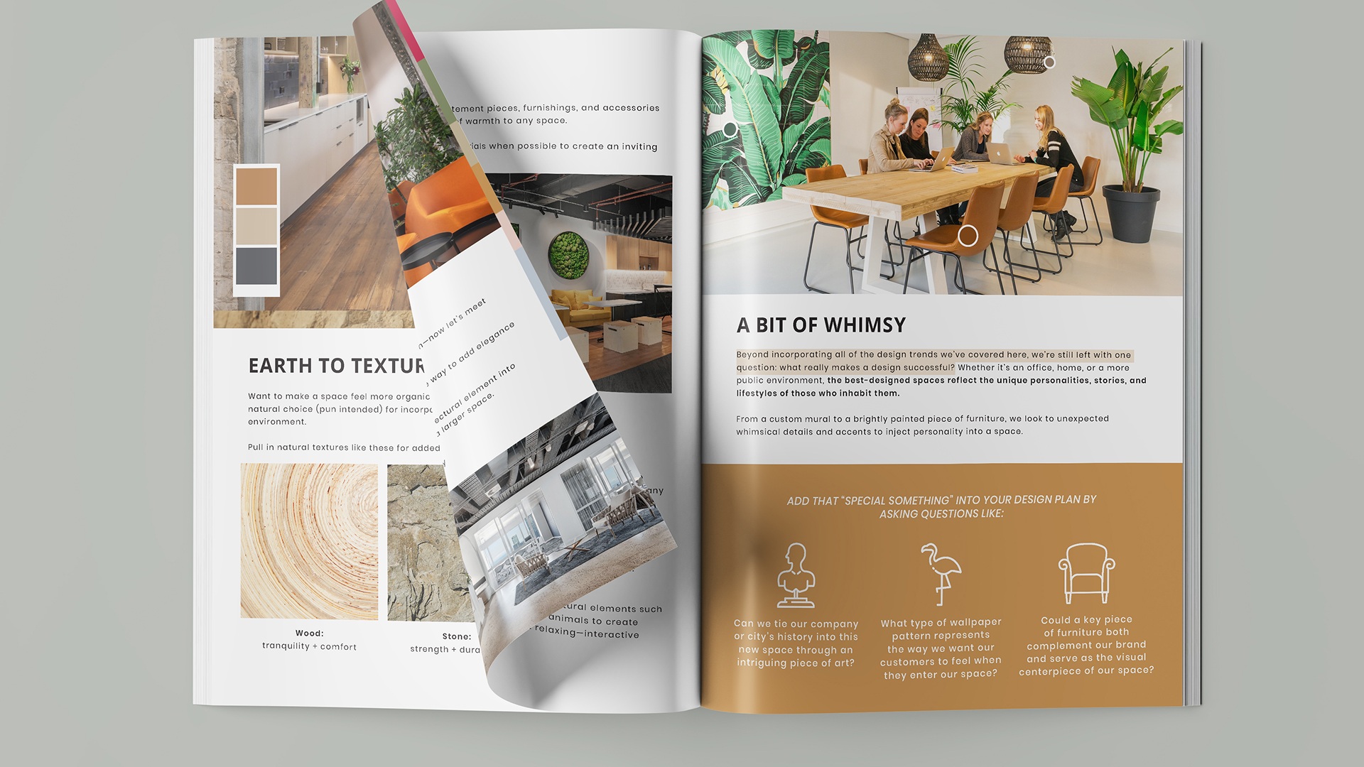
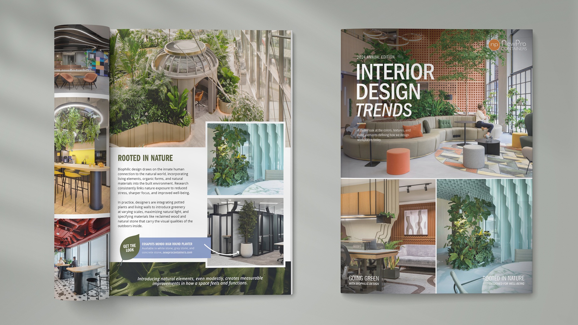
Sourcing imagery was a significant part of the research process. Every photo was selected to reflect real, well-executed commercial spaces rather than idealized renders, which kept the guide grounded and gave the audience something they could reference.

Design Process

The guide was laid out in Adobe InDesign, with Figma used earlier in the process to prototype structure and explore layout directions before committing to the final format. Working this way kept decisions flexible during the planning stage and made the InDesign build more efficient.

Each edition followed a consistent structure: a lead color story, followed by a series of trend chapters, each with supporting imagery, brief copy, and design tips. That template evolved across the five editions but stayed recognizable enough to reinforce the series format.

Image sourcing was built into the workflow from the start rather than treated as a finishing step. Finding the right photography shaped how trends were framed and occasionally influenced which topics made the cut. Copy was written first in draft, then refined with input from the marketing team before being flowed into the layout.

Visual Direction

The visual approach was built around real spaces. Every image was sourced from actual commercial interiors rather than styled shoots or product photography, which grounded the guide in environments the audience recognized and worked in. The photography did a lot of the heavy lifting, so the layout stayed clean and gave the images room to speak.

Typography and color usage tracked with the trends being covered each year, making the guide itself a visual expression of the content rather than just a container for it. Each edition reflected that year’s color story across accent colors, section headers, and the palette swatches included throughout.

Icons were sourced and integrated to support scannability, particularly in sections covering biophilic design benefits where data points needed a visual anchor. The overall tone was editorial rather than promotional, closer to a trade publication than a marketing brochure, which suited the audience and reinforced the brand’s position as a credible voice in the space.

Final Design

Each edition was produced as a paginated PDF, designed to work both as a gated download and as an email asset. The format needed to hold up in both contexts, read well on screen, and feel substantial enough to be worth saving and returning to.

The guide was structured to move from color story into trend chapters, each one self-contained but connected by a consistent visual language. That structure made it easy to navigate and allowed readers to dip in and out without losing the thread. Design tips and pull quotes were used throughout to break up the reading experience and give the audience actionable takeaways alongside the editorial content.

In later editions, the work extended into social media graphics that drew directly from the guide content, extending the shelf life of each release and giving the trends a presence across additional channels.

Five editions were produced across five years, each one refined based on what the previous version had established. The series format was intentional, each guide building brand recognition over time and giving the audience a reason to come back the following year.

Outcome & Impact

The guide became an anticipated release each year, which reflected how well the content had connected with the audience’s interests and working lives.

The series contributed to brand awareness within a niche but influential space. The extended reach into social media in later editions broadened that presence further and kept each guide relevant beyond its initial release.

Reflections

Five editions of the same project is enough time to learn what the format can and can’t do. The clearest takeaway is that editorial credibility is hard to establish and easy to lose. Keeping the content useful to the audience, rather than letting it drift toward promotion, was the most important call to make on every edition.

Having creative ownership over a project from research through to final layout is a different kind of responsibility than executing a defined brief. It reinforced the value of building a clear internal framework early, both for the content and the visual language, so that consistency across years felt intentional rather than accidental.

Working across both the writing and design on the same project also sharpened an awareness of how the two disciplines inform each other. Decisions made in copy affected layout options, and visual choices sometimes pushed the writing to be tighter or more specific.

Across all five years, it was one of the more enjoyable projects to work on. The research process meant staying curious about the industry, and the creative freedom made each edition an opportunity to experiment with layout in ways that weren’t always available on more defined briefs. That combination of learning and making is something that doesn’t come along often.

Deliverables

01

Editorial Design: Five annual trend guides produced as paginated PDFs, each covering interior design trends and colors for a B2B audience.

02

Content & Copy: Original editorial copy written for each edition, covering trend analysis, design tips, and biophilic design principles.

03

Image Direction: All photography sourced and curated from real commercial interiors to support each trend chapter across five editions.

04

Social Media Graphics: Supporting graphics produced in later editions to extend the reach of each guide across social channels.

Up Next

Brand Launch Campaign: Retail Content & Amazon Storefront