Back to projects
Art Direction, Graphic Design

Brand Launch Campaign: Retail Content & Amazon Storefront

When our team brought on a new Belgian-designed planter line, we needed a full content suite built from scratch: product imagery, Amazon storefront, campaign graphics, sales tools, and original video. I led the creative execution across all of it, working closely with our eCommerce Manager to prioritize content that would drive sales first. What started as a single brochure grew into a three-month buildout that directly supported a measurable lift in Amazon sales.

Role Art Director / Graphic Designer
Timeline 4 Months
Deliverables Art Direction, Graphic Design

The Context & Why

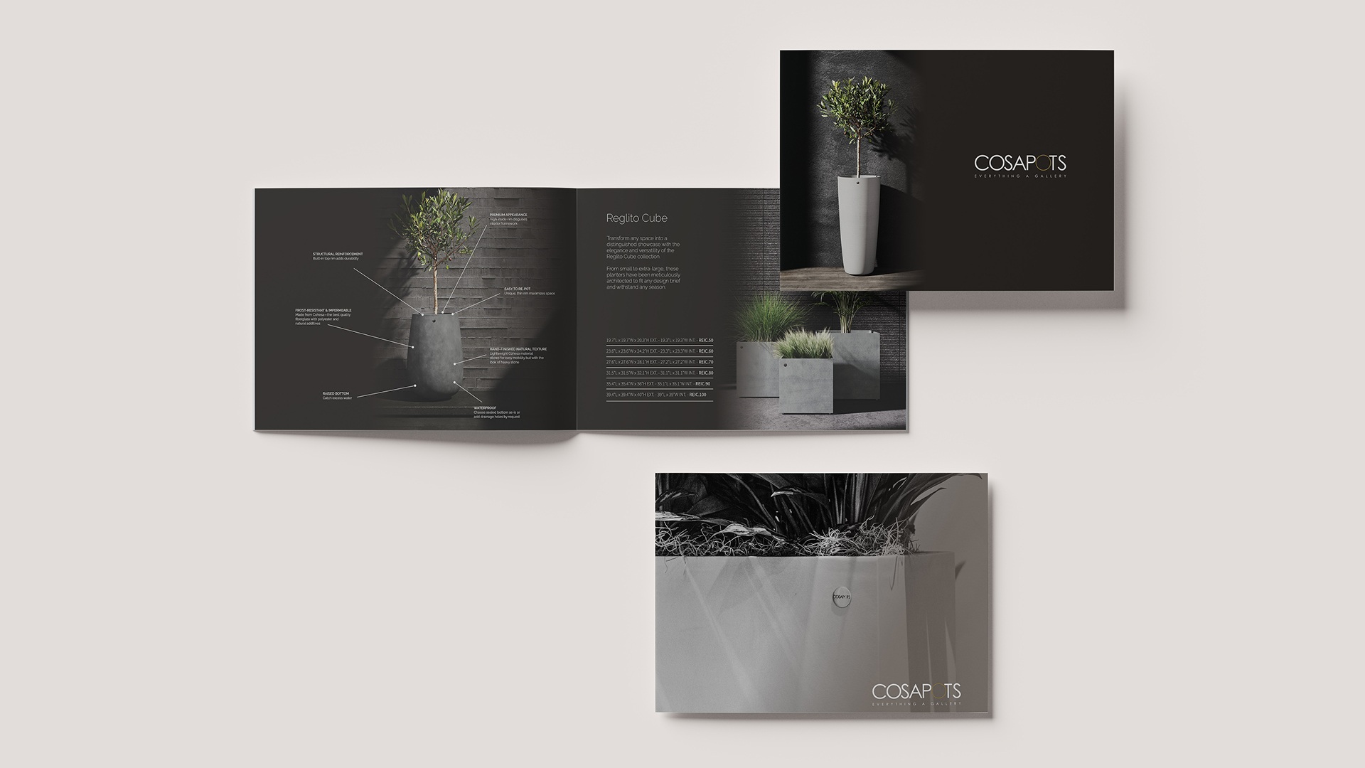
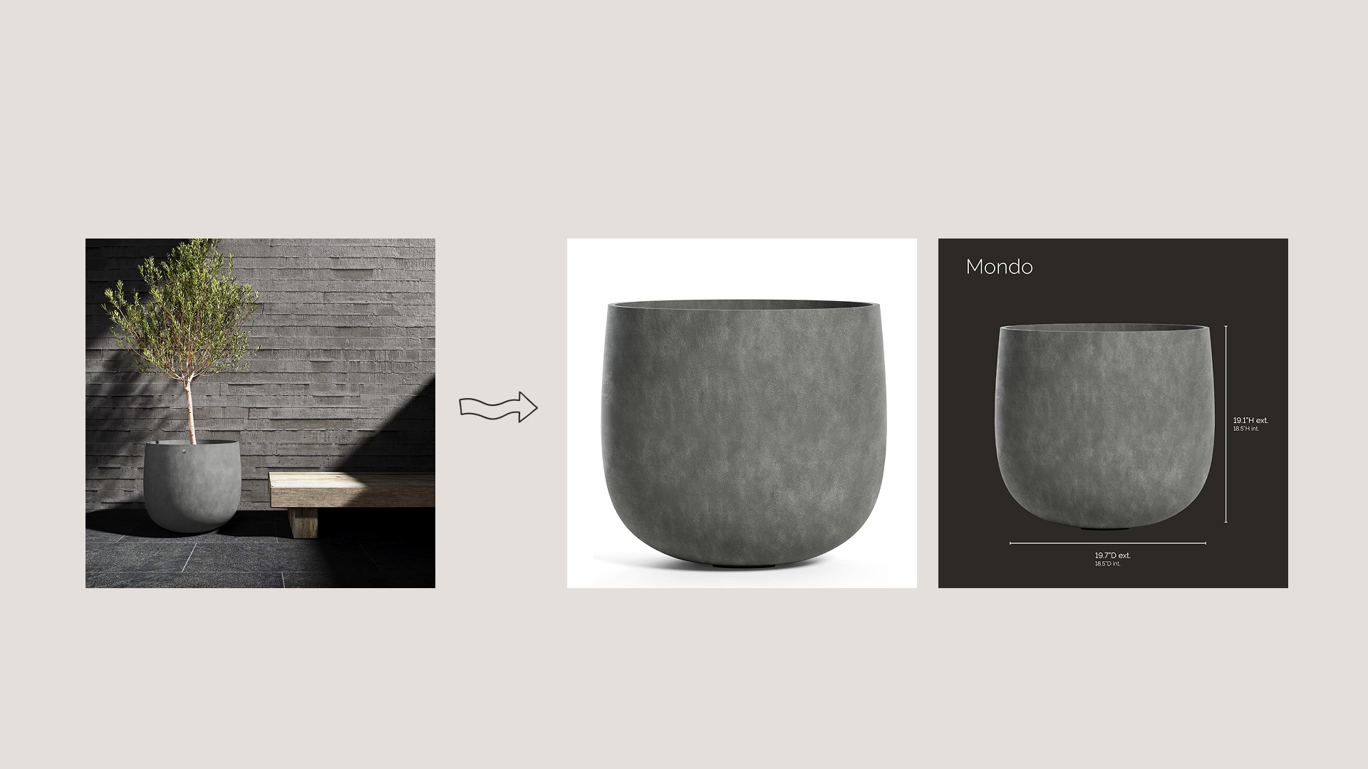
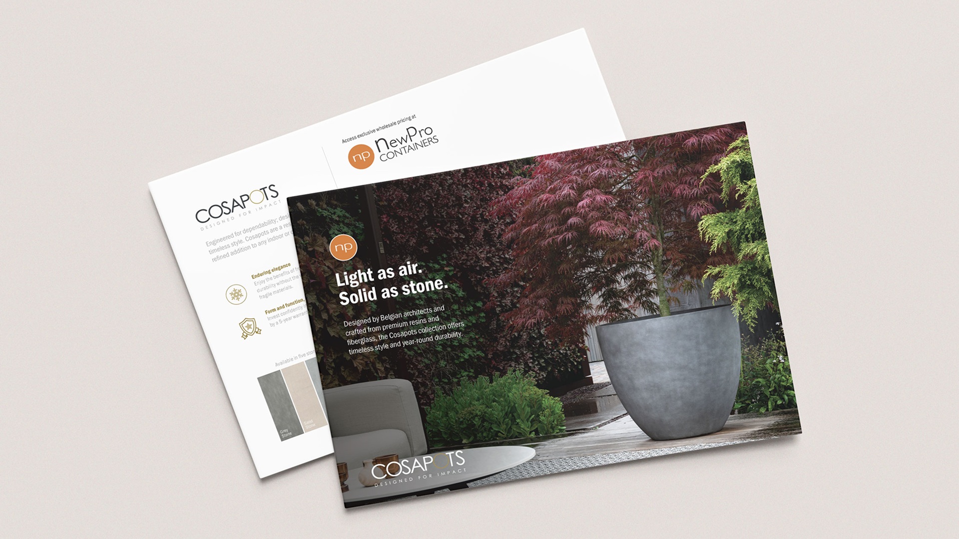
Bringing a new brand to market on both a company website and Amazon isn’t just a design challenge. It’s a content infrastructure problem. We had product photos from the supplier, but nothing tailored to our audience or our channels. No storefront, no campaign assets, no sales tools. Without that supporting content, the brand had no real presence and no way to convert.

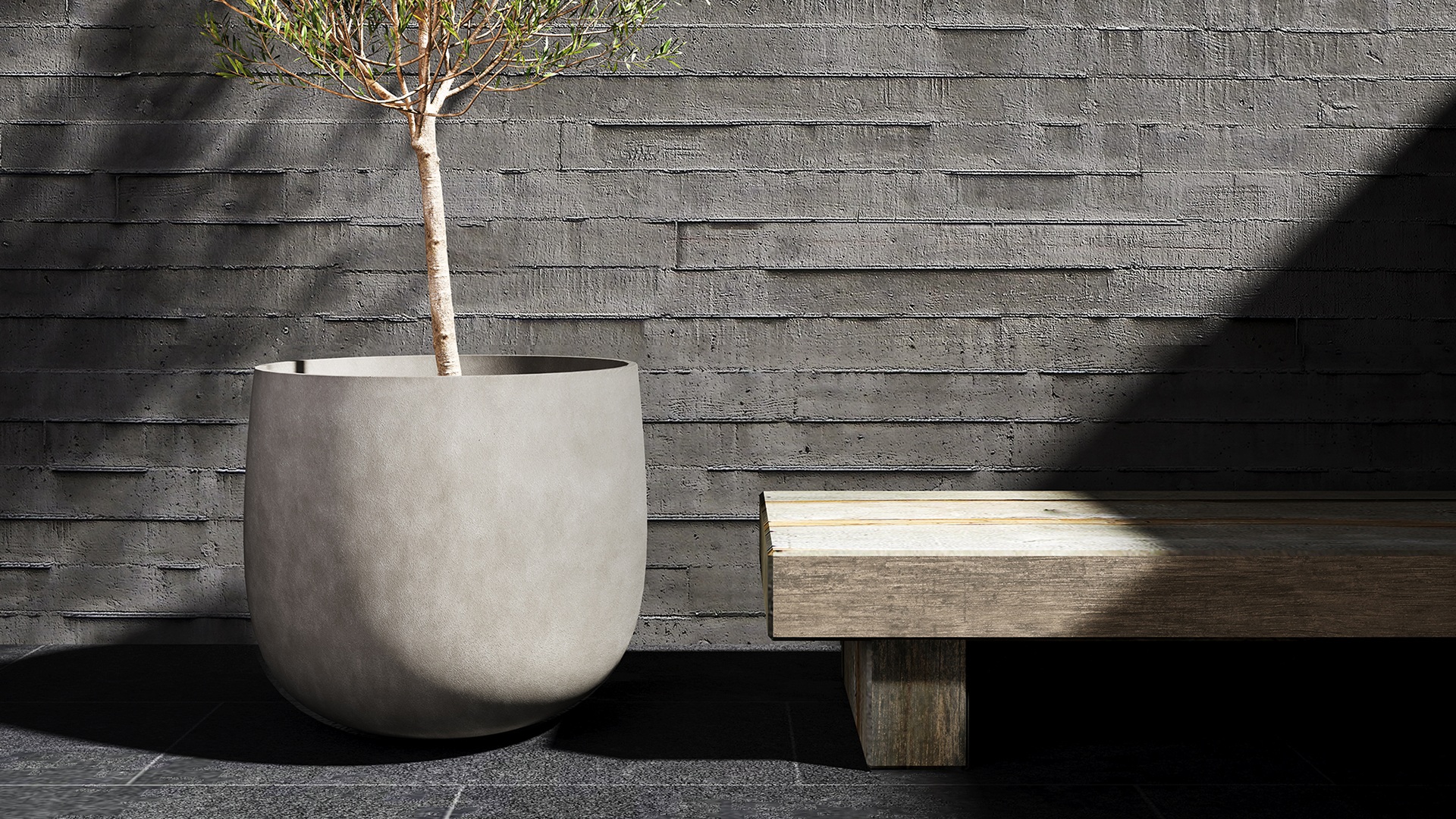
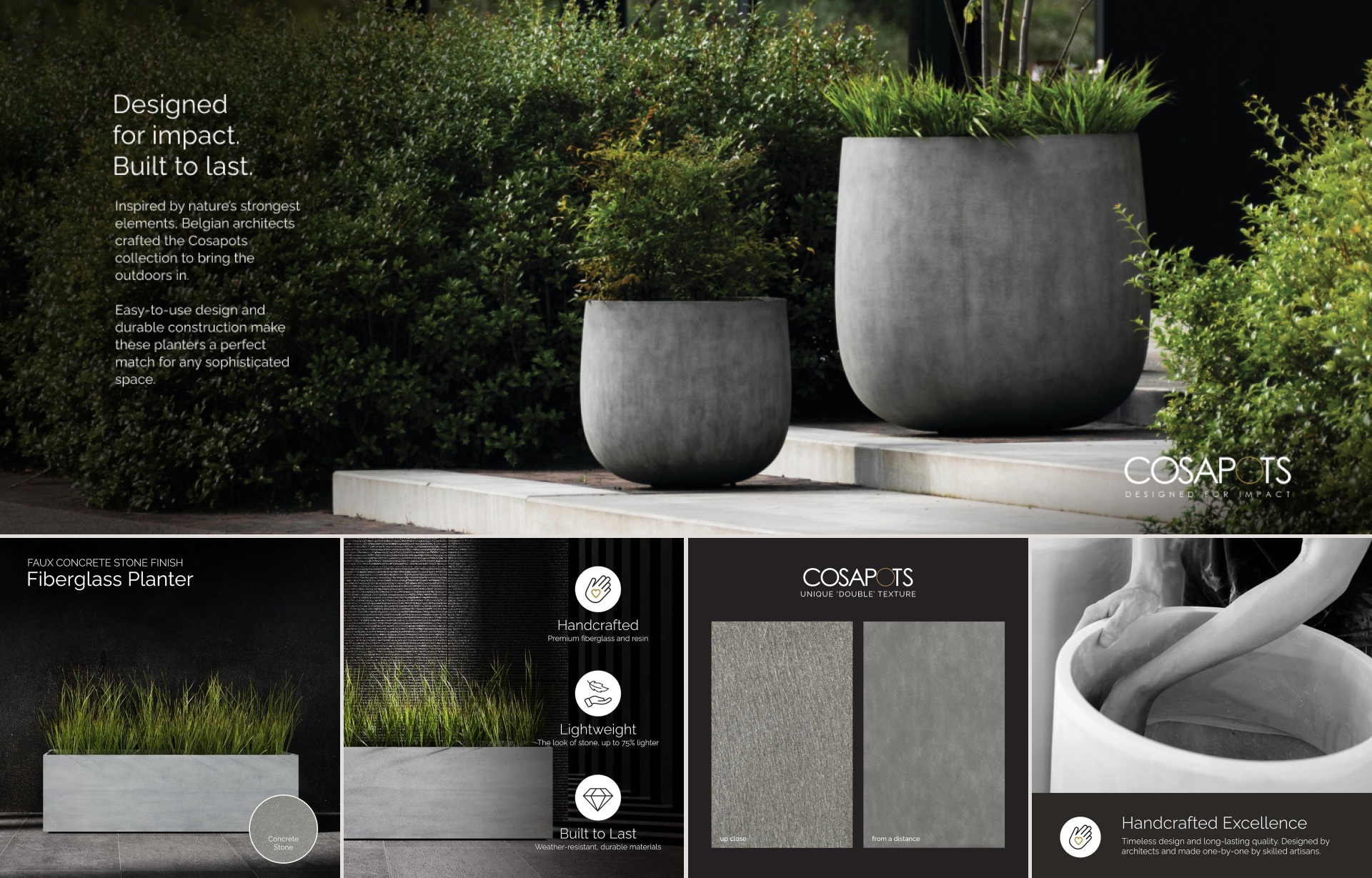
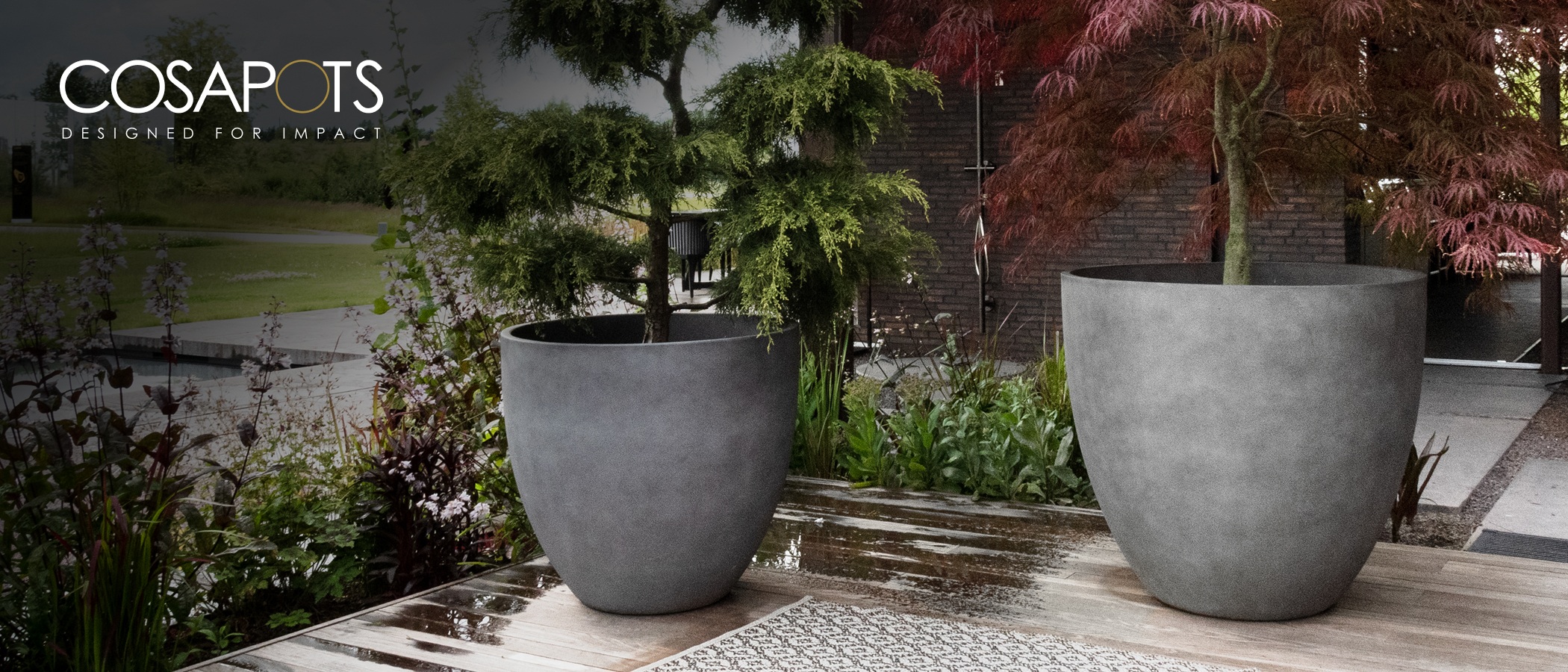
The planter line itself had a strong identity: handcrafted, architect-inspired, built for both indoor and outdoor spaces. Belgian designed, with a distinctive look that set it apart from typical retail planters. The opportunity was clear, but only if we could communicate it well. My job was to take the brand’s existing design system and translate it into content that worked for our customers, our sales team, and the specific demands of Amazon’s ecosystem.

Challenges & Approach

The project started as a sales brochure request and expanded. Scope grew to include Amazon A+ content, a full storefront, product images, campaign cards, and video. Prioritization became the core working method.

We were selling to two distinct groups: plant professionals and trade buyers on the B2B side, and interior designers and general consumers on the B2C side. B2B buyers needed practical information fast: scale, durability, installation. B2C buyers needed to see the product in a space that felt aspirational. That split informed how we approached messaging, imagery, and which features we led with depending on the channel.

Amazon added another layer. Shoppers there move quickly and make decisions based on imagery before they read a word. That pushed us to prioritize custom product images early, working with the eCommerce Manager to sequence revenue-driving content first and everything else after. We launched in phases, and when the A+ content went live alongside the custom product imagery, sales improved noticeably.

The other challenge was operating within someone else’s design system. The brand had established rules on logo usage, typography, and color, and they weren’t flexible. The work was in adapting that system to contexts it wasn’t originally built for, like Amazon’s templated environment and our own channel formats, without losing what made the brand distinctive.

Design Process

The process was iterative by necessity. With scope expanding over three months, each content type had its own cycle (brief, concept, adapt to constraints, refine, deliver) while the broader campaign ran in parallel.

Most work was routed through the eCommerce Manager, keeping decisions fast and focused. For other pieces like the postcards, feedback came from the broader marketing team. Either way, approval layers were minimal.

Working within the supplier’s design system meant the early phase was less about concepting and more about translation. Figma was central to layout and prototyping, Illustrator and Photoshop handled digital asset production, InDesign covered the print work, and Premiere handled video.

Ideas & Concepts

The central creative challenge was making a premium European brand feel relevant to our specific audience without diluting what made it distinctive. The supplier’s own photography set a high bar: dramatic, editorial, architect-minded. That visual tone was the anchor. The concept across all formats was to build on that foundation and give it context for our channels and customers.

For the campaign, we developed two directions. The brand introduction focused on communicating what the line was: the craftsmanship, the scale, the design heritage, for customers encountering it for the first time. The evergreen postcards leaned lifestyle, showing the product in use across indoor and outdoor spaces. Both needed to work across B2B and B2C channels, so the imagery and hierarchy were designed to speak to each audience without feeling like a compromise.

For Amazon, the concept was clarity and confidence. The platform rewards imagery that answers questions before a customer thinks to ask them: size, finish, context, scale. The supplier’s photography was striking but not built for a product listing. Every supporting image I created was conceived to bridge that gap, grounding the editorial aesthetic in something more direct and purchase-ready.

Visual Direction

The visual direction was set by the brand’s own design system, and that was the right call to follow. The typography, color palette, and logo rules were non-negotiable, and they didn’t need to be challenged. The system was well considered and the photography was already doing heavy lifting.

The creative work was in the adaptation, and not all the raw material was equal. The supplier’s photography was dramatic and editorial: architectural scale, controlled light, minimal styling. Photography from our own team reflected a different context: brighter, warmer, styled for commercial interiors. Both had to live in the same campaign without one undermining the other.

That meant leaning on layout, typography, and graphic framing to create visual consistency across sources. Every format, from Amazon storefront to postcards, brochure to video, required its own judgment call about how to present what we had while keeping the brand feeling premium and cohesive.

Final Design

The Amazon presence included a full storefront build and A+ content, plus custom product images created specifically for the listings. They were purpose-built to answer the questions a customer has at the point of purchase: scale, finish, context, installation. The storefront gave the brand a cohesive home on the platform rather than just a collection of product pages.

The print and campaign work included the sales brochure, the project that started everything, along with the evergreen postcards distributed across both B2B and B2C channels. Both had to carry the brand confidently into a physical format, which meant getting typography and image hierarchy right for something a customer or trade buyer holds in their hands.

The video content split into two tracks. For footage sent by the brand, the work was editorial: selecting clips, sequencing, choosing music, writing text overlays. For original content, I planned, filmed, and edited: lifestyle shots with plants in the planters, installation sequences, and finish and color showcases. The goal across both was to give the brand motion and personality without losing the restraint that made the still photography work.

Everything fed into a consistent presence across our website and Amazon, a brand that launched with the content infrastructure it needed to actually sell.

Outcome & Impact

What started as a single brochure grew into a three-month effort spanning Amazon, print, campaign, and video. Staying focused on what would drive sales first, and working closely with the eCommerce Manager throughout, kept the work moving and the output consistent as the scope expanded. The result was a complete retail presence across two channels: storefront, product pages, print collateral, campaign materials, and video.

The clearest sign it worked came from Amazon. Launching in phases meant the A+ content went live after the initial storefront, creating a natural before-and-after. When the custom product imagery and A+ content were in place, sales responded noticeably. The lift was clear.

What we built wasn’t just a launch package. It was a content foundation. The visual system was established, the brand had a unified presence across channels, and social content followed.

Reflections

A project that grows from one deliverable into many requires as much organizational discipline as creative. The collaboration with the eCommerce Manager was central to keeping things on track, having one clear point of alignment made it easier to absorb new requests without losing focus on what mattered most.

The prioritization framework, revenue-driving content first and everything else after, is something I’d apply from the start on any similar project. It sounds obvious, but it requires discipline when requests keep coming in and everything feels urgent. Knowing what the content actually needed to do made those calls easier.

Working within someone else’s design system was a useful constraint. It forced clarity about what was actually a creative decision versus what was execution. The real work was in the translation: figuring out how to make a system designed for one context function well in another.

It reinforced something worth carrying forward. The earlier you define scope, the more energy goes into the work itself.

Deliverables

01

Amazon & eCommerce: Full Amazon storefront design, A+ content, and custom product listing images built for conversion across multiple SKUs.

02

Print & Campaign: Sales brochure for the trade team, plus evergreen postcards developed for both B2B and B2C channels across two brand audiences.

03

Video: Original lifestyle, installation, and finish showcase videos: planned, filmed, and edited. Additional brand-supplied footage edited with text, music, and sequencing.

04

Social Media & Web: Supporting social content and web assets developed following the initial launch to extend the campaign across owned channels.

Up Next

Greenline: Brand Identity & 3D Visualization