Back to projects
Brand Identity, Art Direction, 3D

Greenline: Brand Identity & 3D Visualization

Greenline was an existing internal brand with a logo and color palette but no real visual language to build on. Over four months I redesigned the identity from the ground up, built a complete 3D product rendering system, and developed the full asset suite for an Amazon launch. The result was a cohesive brand that could compete at a premium price point across every channel it needed to show up in.

Role Art Director & Graphic Designer
Timeline 16 Weeks
Deliverables Brand Identity, Art Direction, 3D

The Context & Why

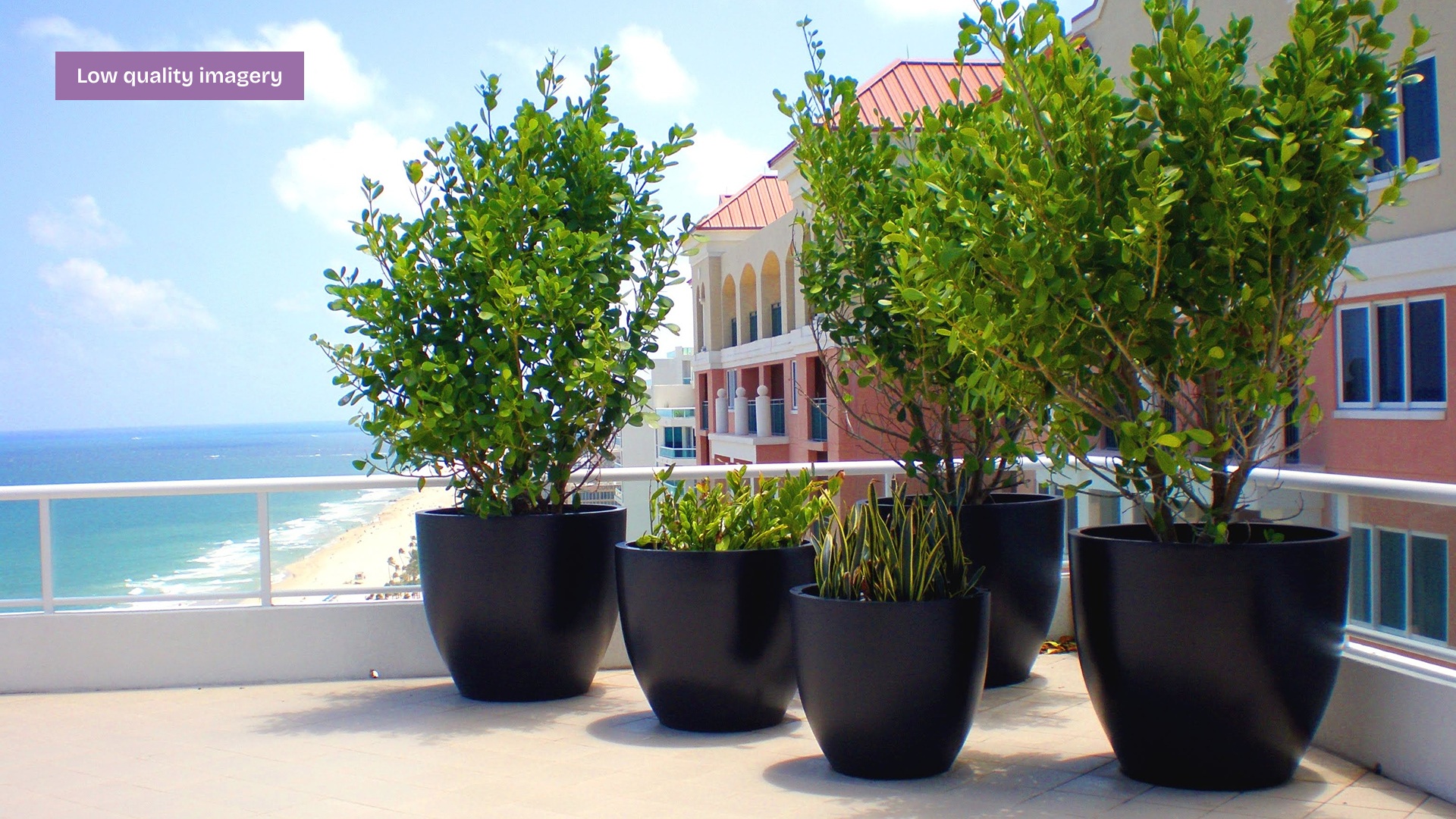
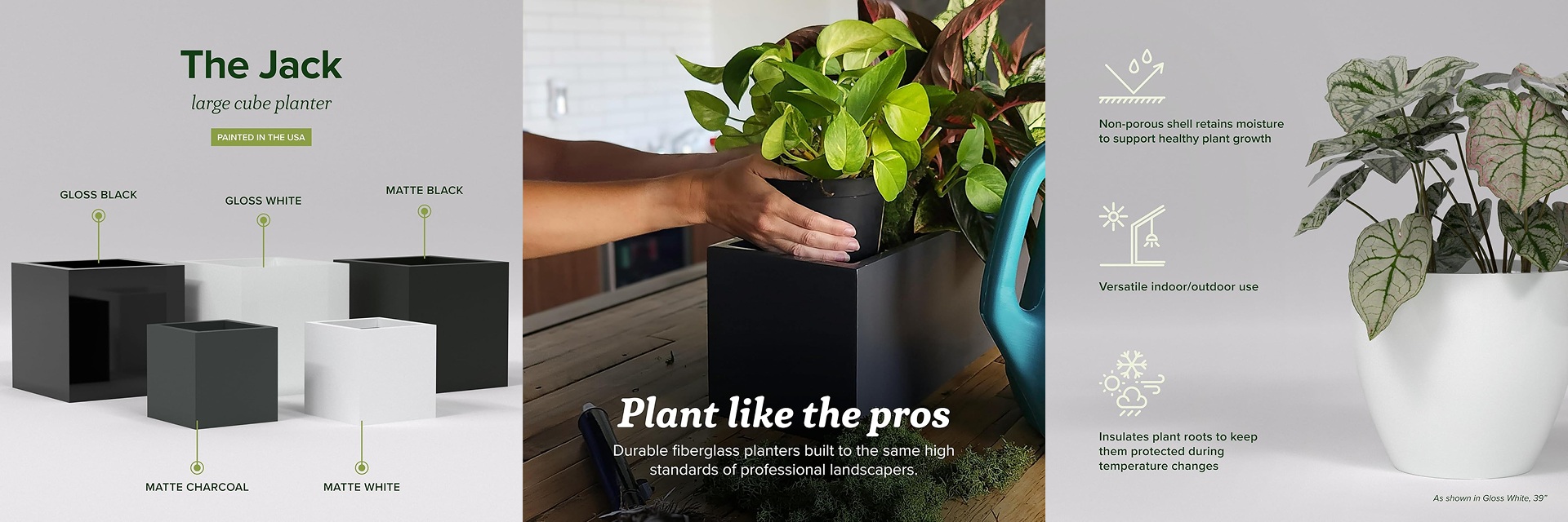
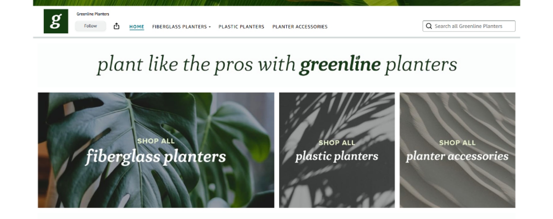
Greenline was an existing internal brand selling metal and fiberglass planters through its own website. Expanding onto Amazon and other third-party marketplaces required more than a channel strategy. At a premium price point, competing for a design-conscious customer meant the brand itself had to do more work.

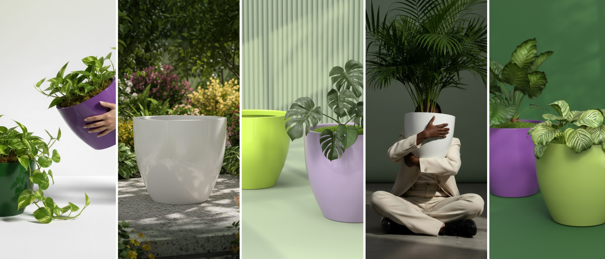
The existing branding had a logo and a color palette of green, black, and grey, but no visual language to build on. It was functional, not aspirational. For a product line spanning large-scale planters at a premium price point, that gap mattered.

Challenges & Approach

The biggest constraint was assets. There was no photography budget, limited time, and the products themselves, some reaching 60 inches wide, were physically difficult to shoot across multiple sizes and colorways. The existing imagery was low quality and wouldn’t accurately represent the new finishes being offered.

3D rendering solved all three problems at once. Consistent, high-quality product images across every size and colorway without a studio, a photographer, or a logistics puzzle. It also meant assets could be updated or extended without a reshoot.

On the brand side, studying premium outdoor planter brands, plant care products, and Scandinavian home goods made the direction clear early. The brands that felt most premium kept their presentation clean, letting the product carry the image. That ruled out a lot of directions quickly and made decisions easier to align on with the eCommerce Manager.

Design Process

The defined brief and a clear audience profile compressed the process significantly. Knowing we were speaking to a design-conscious, plant-loving consumer with a high price point tolerance made brand decisions easier to evaluate and faster to align on.

I started by studying the original logo to understand what was worth keeping. The existing mark was clean and minimalist but lacked sophistication. A structural imbalance, a large G stacked above the brand name and subtext, made it feel unresolved. I carried forward a similar secondary font and stayed in the green family, deepening the tone to anchor the new direction.

During the process I questioned why the L in GreenLine was capitalized. No one had a clear answer, and once it was raised it was hard to unsee. Simplifying to Greenline was a small change that made the wordmark cleaner and the brand feel more like a proper noun than a descriptor.

On the 3D side, I built a Cinema 4D studio template that could render every product consistently and be extended as new styles were added. Renders were produced at resolutions suitable for both print and web from the start.

Ideas & Concepts

The early exploration covered more ground than the final brand suggests. Colorful backdrop renders and various flooring treatments were tested before it became clear that neither matched where the brand was heading. The flooring approach in particular would have multiplied the asset workload without adding value, and colorful backdrops introduced visual noise that worked against the restrained, premium direction.

The wordmark exploration centered on finding a typeface that felt design-forward without tipping into corporate territory. A dark forest green serif-italic landed as the right combination: the italic gives the mark energy and personality, and the botanical association suits a home and garden brand at this price point. The deeper green was a deliberate shift from the original, fresher and more sophisticated, and better suited to the customer we were designing for.

Packaging concepts were developed as a forward-looking exercise in case Greenline became a standalone retail brand. They weren’t part of the brief but helped stress-test the identity and think through how the visual system would extend beyond digital.

Visual Direction

The direction landed on clean, lifestyle-informed product presentation. The goal was to position Greenline as premium but approachable, design-forward and nature-rooted without feeling rustic or earthy.

The 3D renders followed the same restrained approach. White backgrounds for marketplace listings, clean neutral environments for lifestyle context. No props competing with the product, no styling that would date quickly. The renders needed to work on Amazon, on social, and in any future campaign without feeling out of place.

Final Design

The final brand system gave Greenline a coherent visual language across every format. Logo suite, color palette, typography, and a Figma design system that could be handed off and extended without starting from scratch each time.

The 3D rendering system produced 600 product renders across 5 planter shapes, 5 colorways, and 24 sizes. Every render was produced at resolutions suitable for both print and web.

The Amazon presence included a store landing page, A+ content templates, and informational graphic templates built to work within the platform’s constraints while maintaining the brand’s visual standard. Social media templates and a pattern and icon set rounded out the asset suite.

Outcome & Impact

Greenline launched on Amazon with the new branding and A+ content in place. Sales increased noticeably following the rebrand and the addition of the new graphic content, a strong signal that the visual content was making a difference at the listing level where purchase decisions are made.

The asset templates were adopted into day-to-day workflow by both the eCommerce Manager and myself, which meant the system continued producing value beyond the initial project.

Reflections

A key lesson from this project was how much a well-defined audience profile accelerates creative decisions. Going in with clear information about who we were designing for meant less time justifying directions and more time refining them. The brief was defined from the start, and that made a practical difference throughout.

The 3D pipeline proved its value beyond solving the photography problem. A templated studio environment meant consistency across every render and a system the team could actually use going forward.

The name change from GreenLine to Greenline was a small thing that mattered. Questioning assumptions that had been in place before the project started, even minor ones, turned out to be part of the work.

Deliverables

01

Brand Identity: Logo suite, color palette, typography system, and Figma design system covering the full visual language of the brand.

02

3D Rendering System: 600 product renders across 5 planter shapes, 5 colorways, and 24 sizes, plus a Cinema 4D studio template for extending the library as new products are added.

03

Amazon & E-commerce: Store landing page graphics, A+ content templates, and informational graphic templates built for the platform.

04

Brand Assets: Pattern library, icon set, social media templates, and packaging concepts developed as a forward-looking extension of the identity.

Up Next

Holiday Vinyl Wrap Collection